brief + concept
In this 3-week design sprint duo project, we were tasked with creating a branding system or campaign for the #WHYVOTE USA contest by Creative Conscience.
My partner was the amazing Kate Dembowski, who focused on social media stills and contributed to much of the visual direction and language essence of this campaign.
My partner was the amazing Kate Dembowski, who focused on social media stills and contributed to much of the visual direction and language essence of this campaign.
featured on instagram and linkedin!
Creative Conscience posted our work on their socials along with a few other students!
// INSTAGRAM LINK
// LINKEDIN LINK
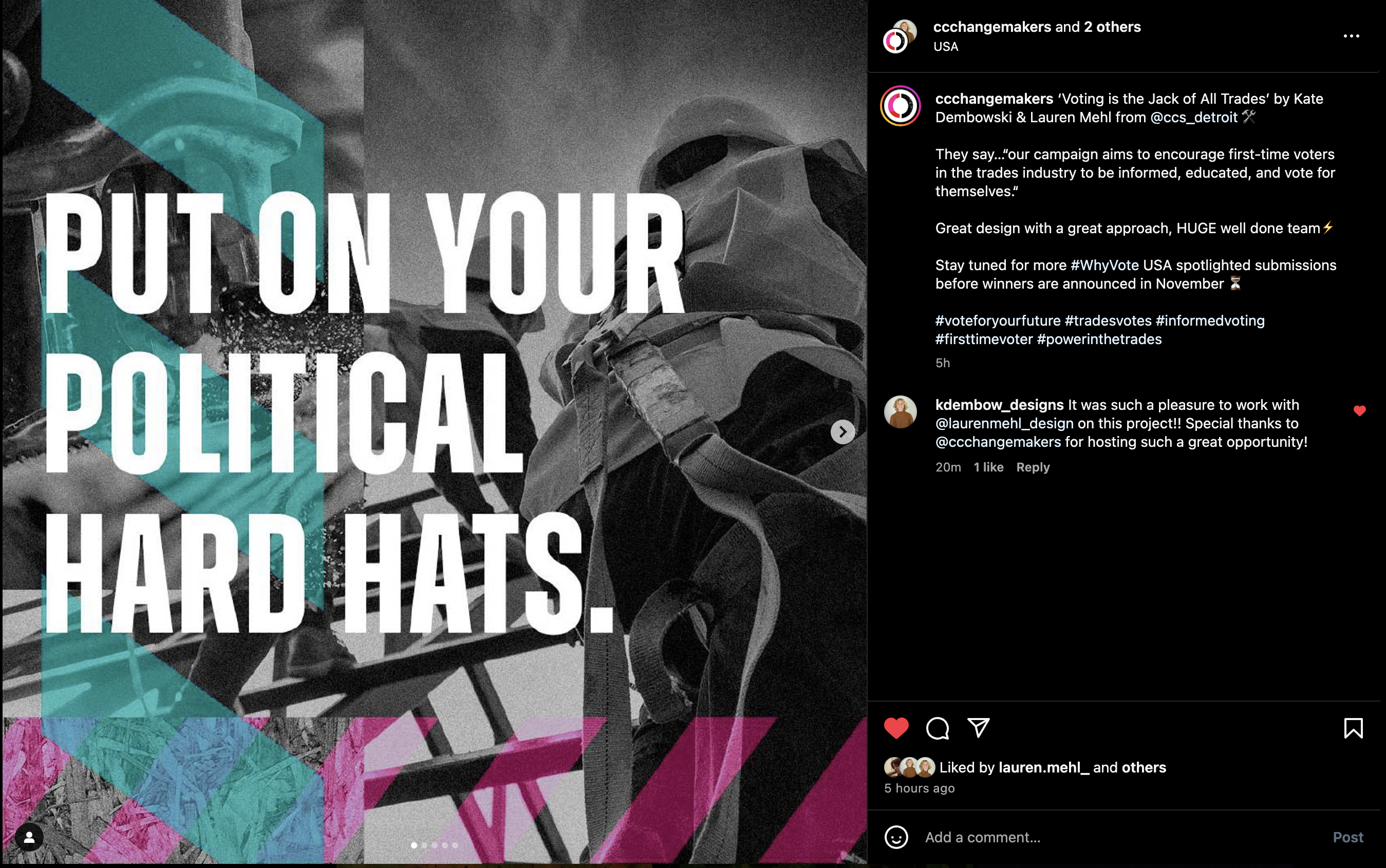

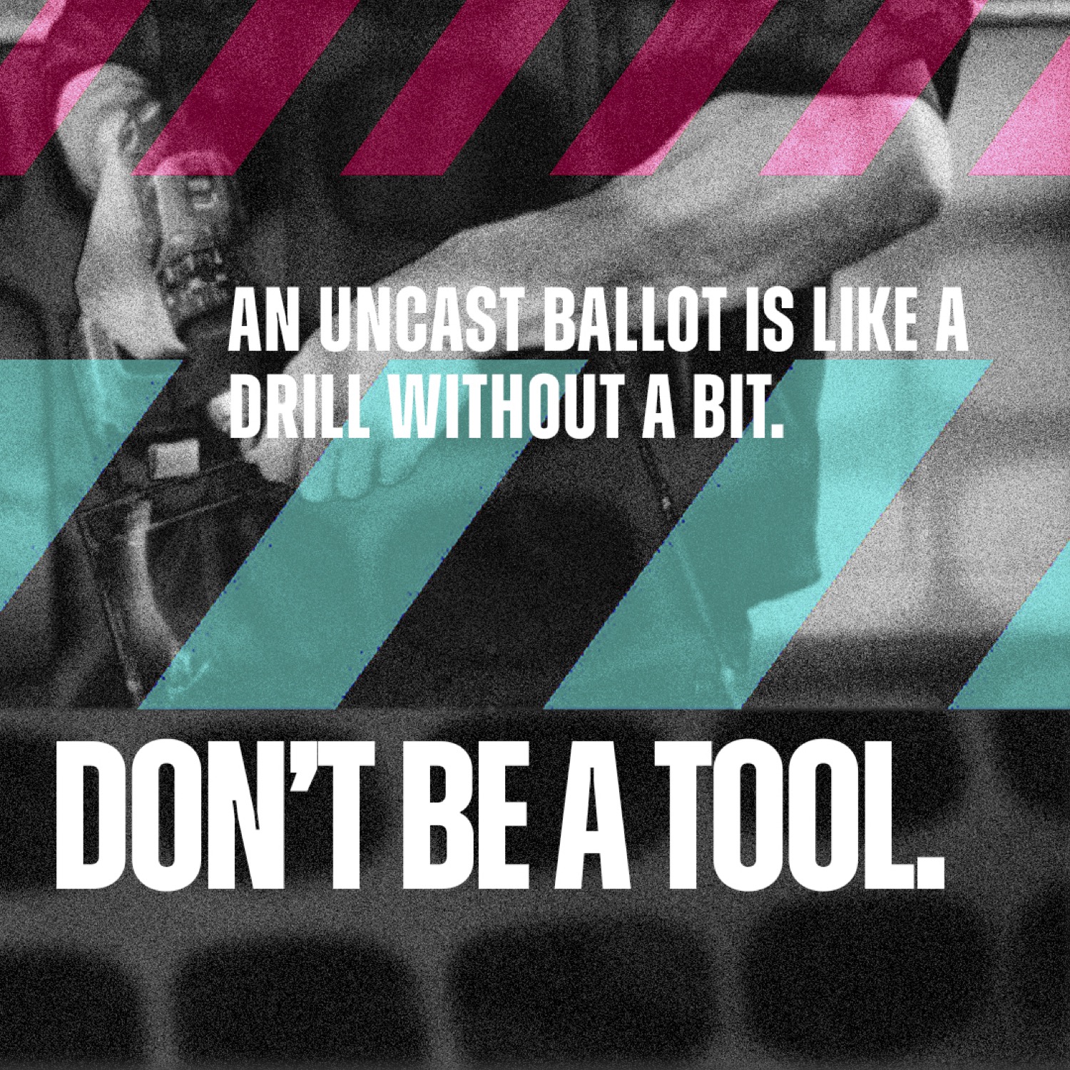
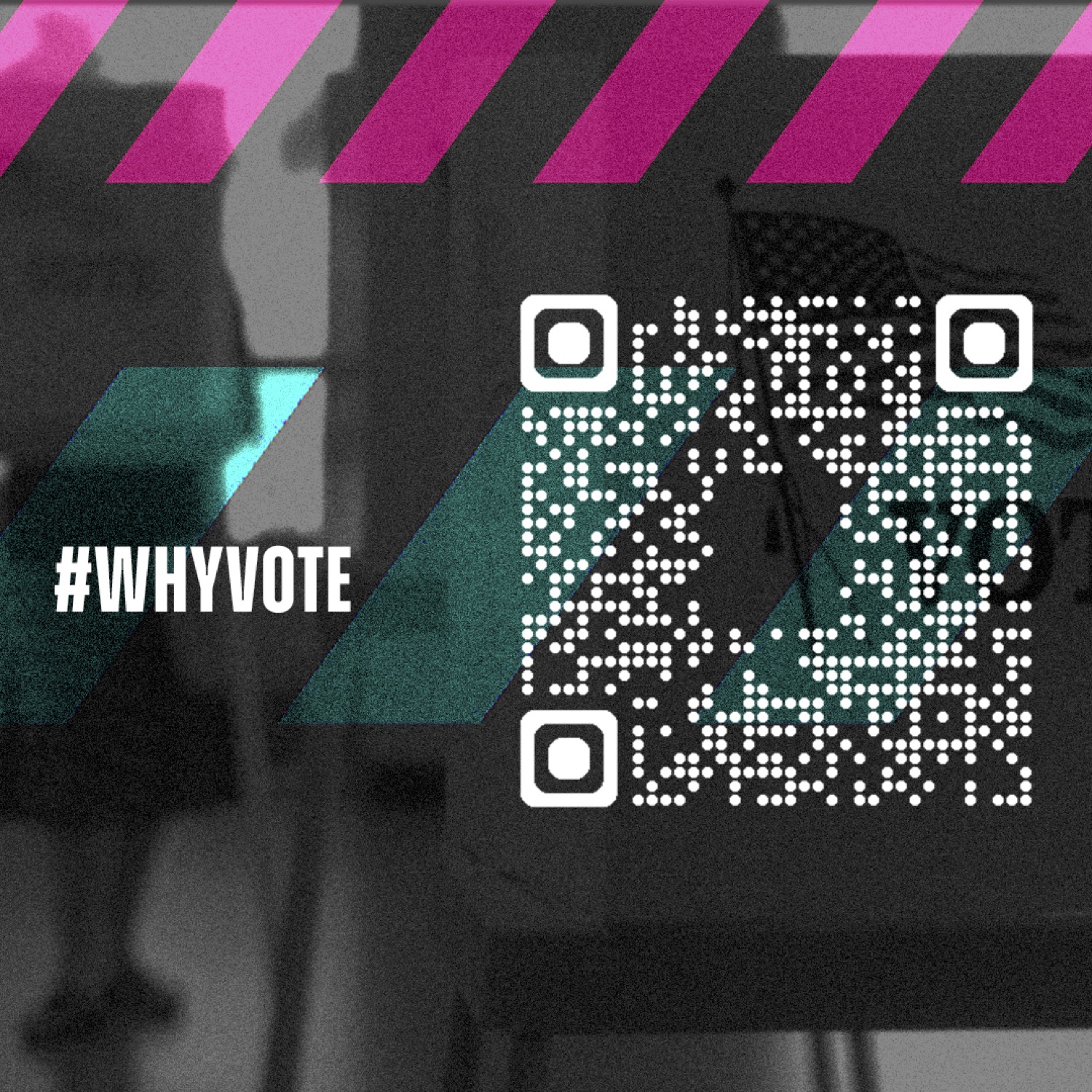
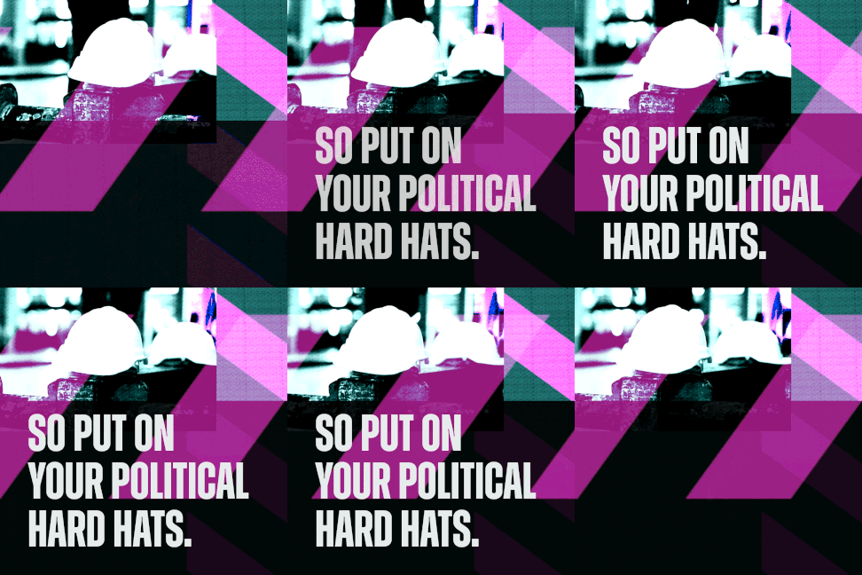
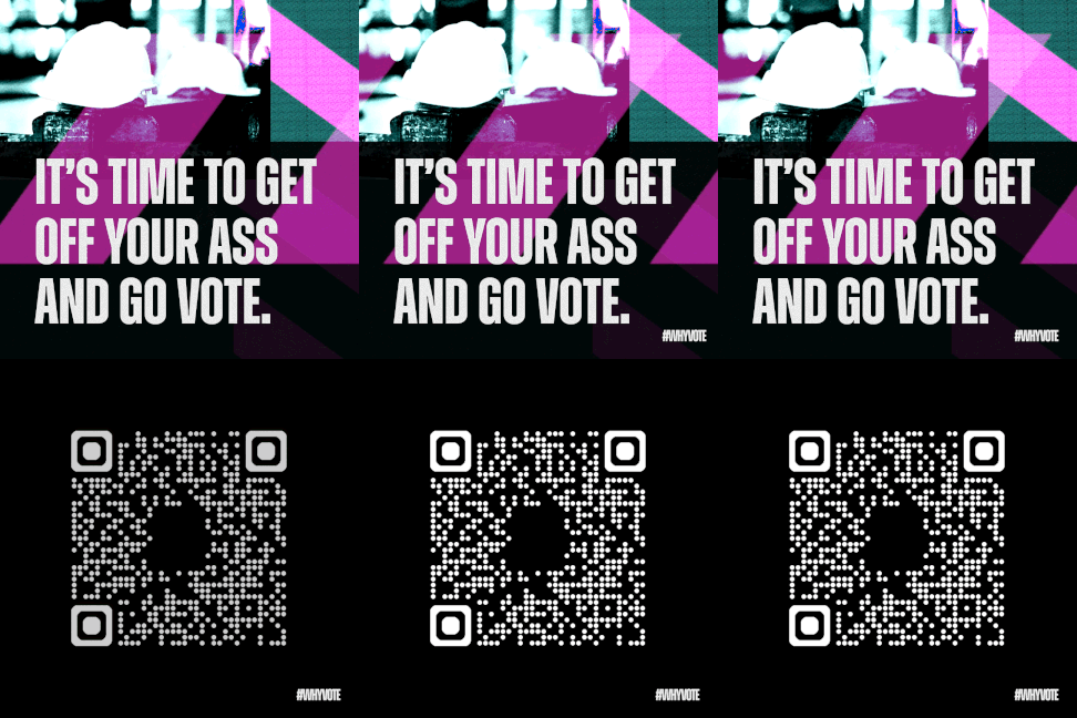
instagram carousel


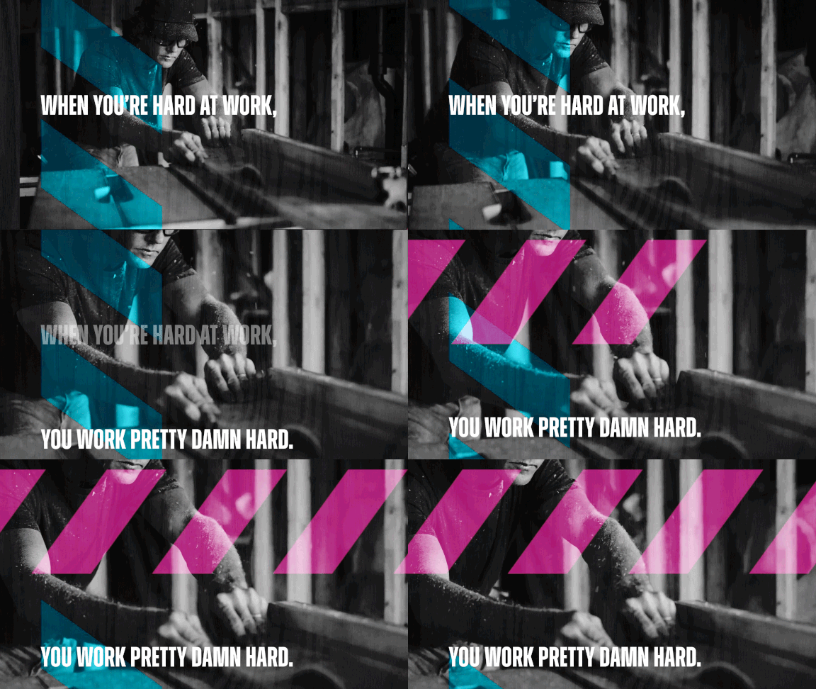
motion graphics for socials + screens


defining our audience
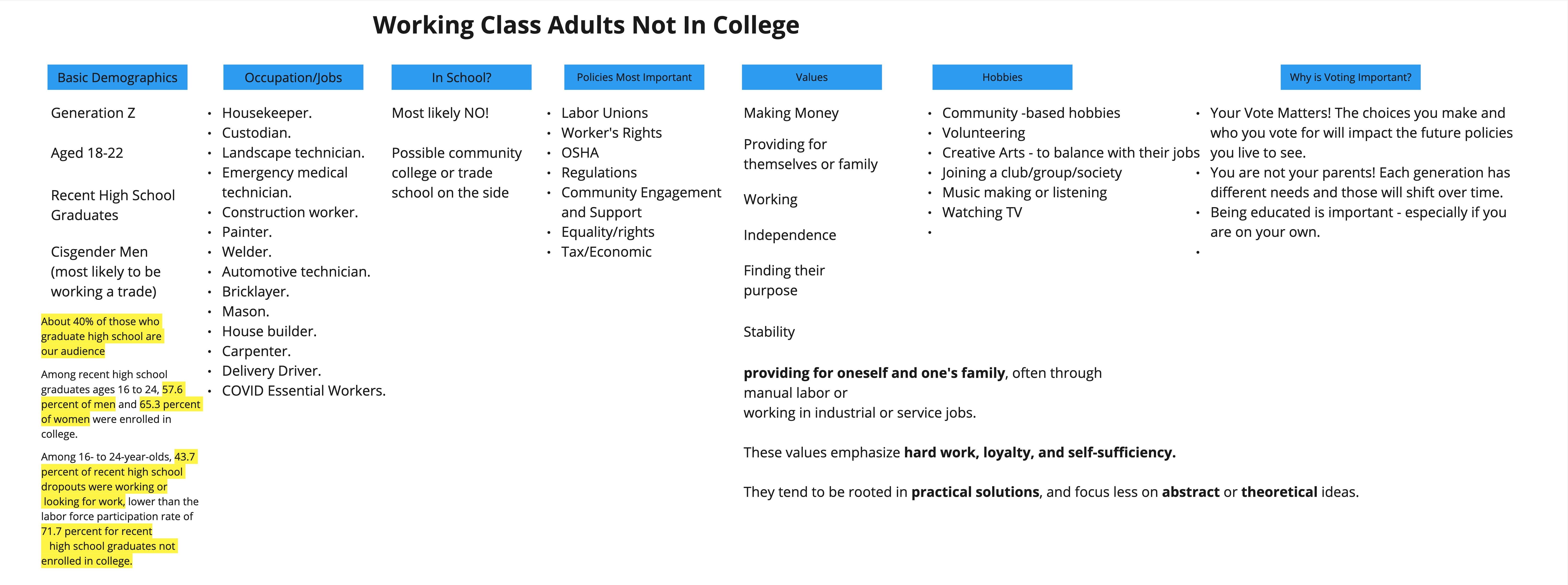
Given both of our ties to working class backgrounds, we decided to focus on people in our generation who work in the trades and are not in school.
concept statement
We researched ways to speak to their values and what they care about, and thus why they should vote to promote those values.
We want first-time voters currently in the workforce to understand how their votes are important, specifically as it relates to their career. By using their right to vote, trades workers are protecting the policies that will protect their business and livelihood for years to come.
We want first-time voters currently in the workforce to understand how their votes are important, specifically as it relates to their career. By using their right to vote, trades workers are protecting the policies that will protect their business and livelihood for years to come.


language + essence
We wanted to focus on details, textures, experiences, and activities that our audience would understand, and use it to speak their language and encourage them to vote for themselves.
People in this demographic value authenticity, stability, and things being clear and direct. We wanted to be the same with our campaign language and messaging.

visual direction
It was then time to start getting visual, but this is also where this project differs from most. Creative Conscience already had a defined brand language and guidelines to follow, so we didn’t have to worry about spending a while picking colors or typography.
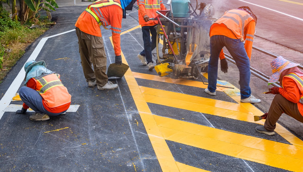
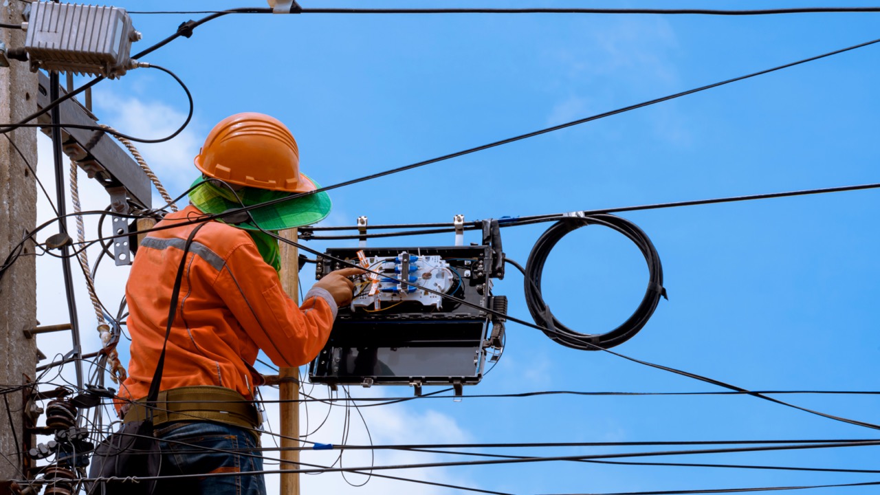
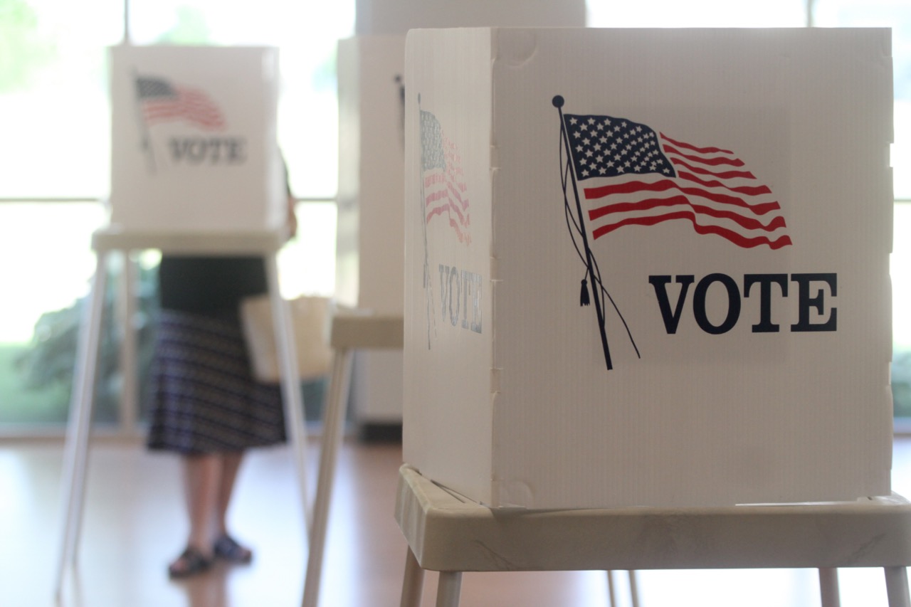
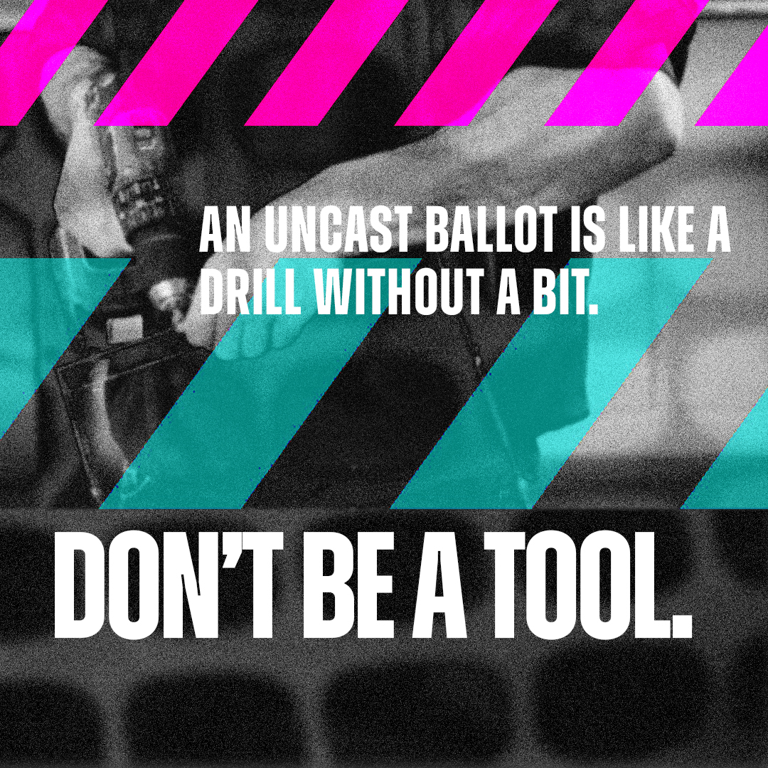
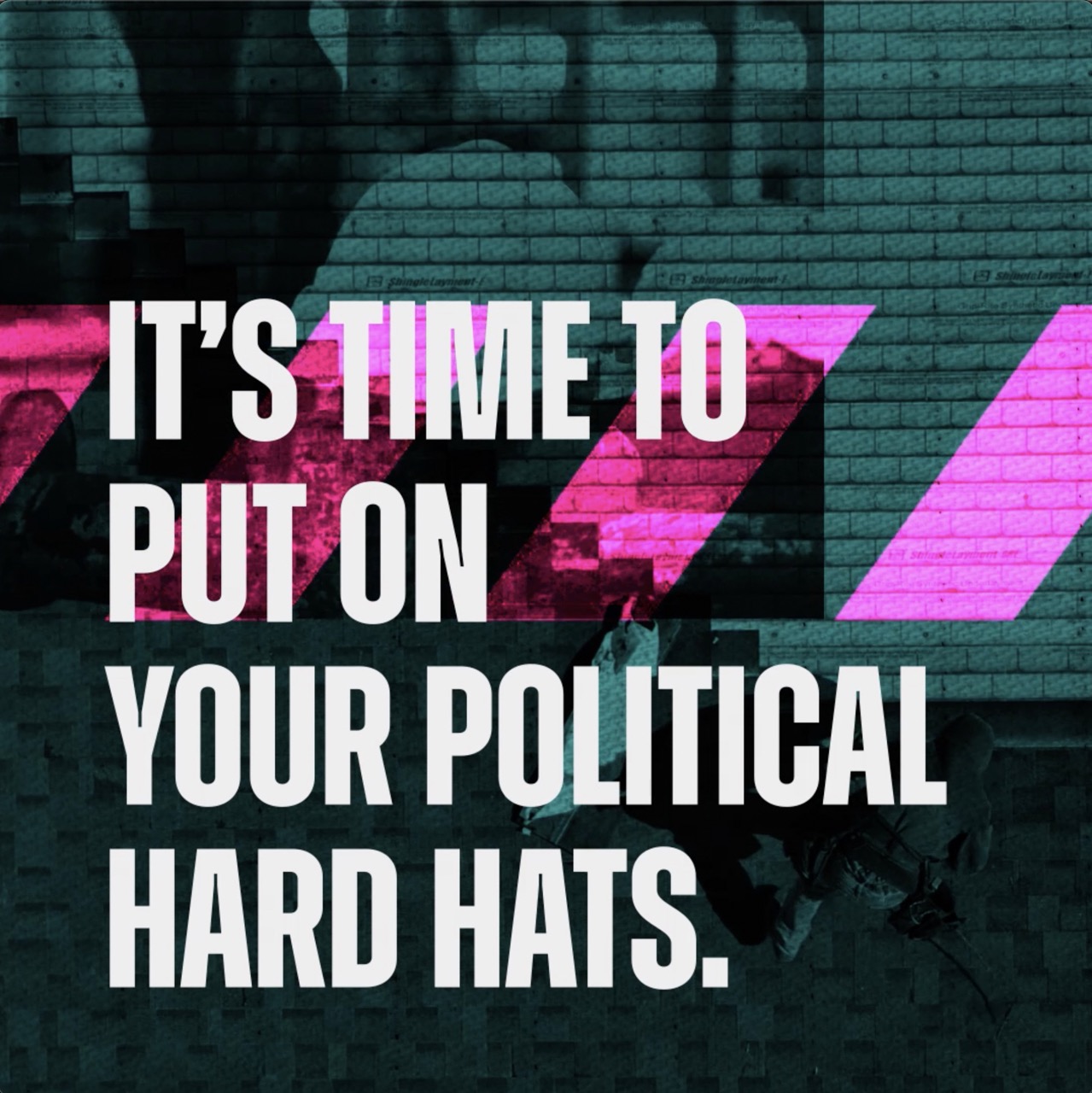
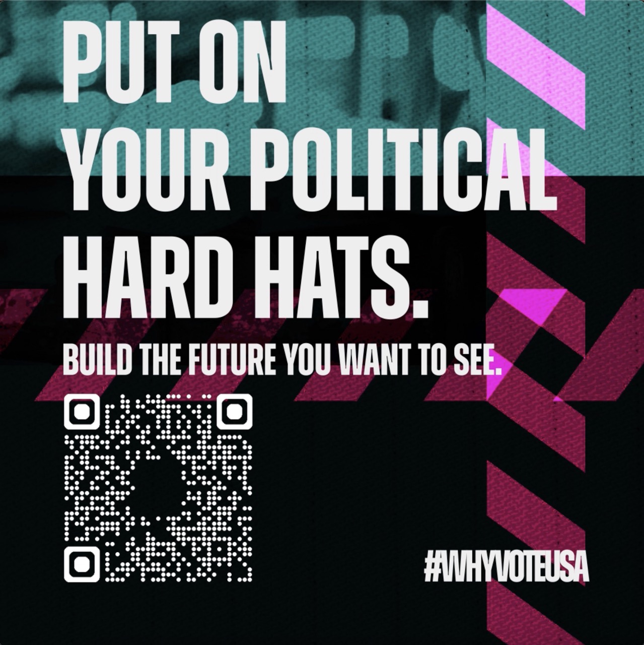
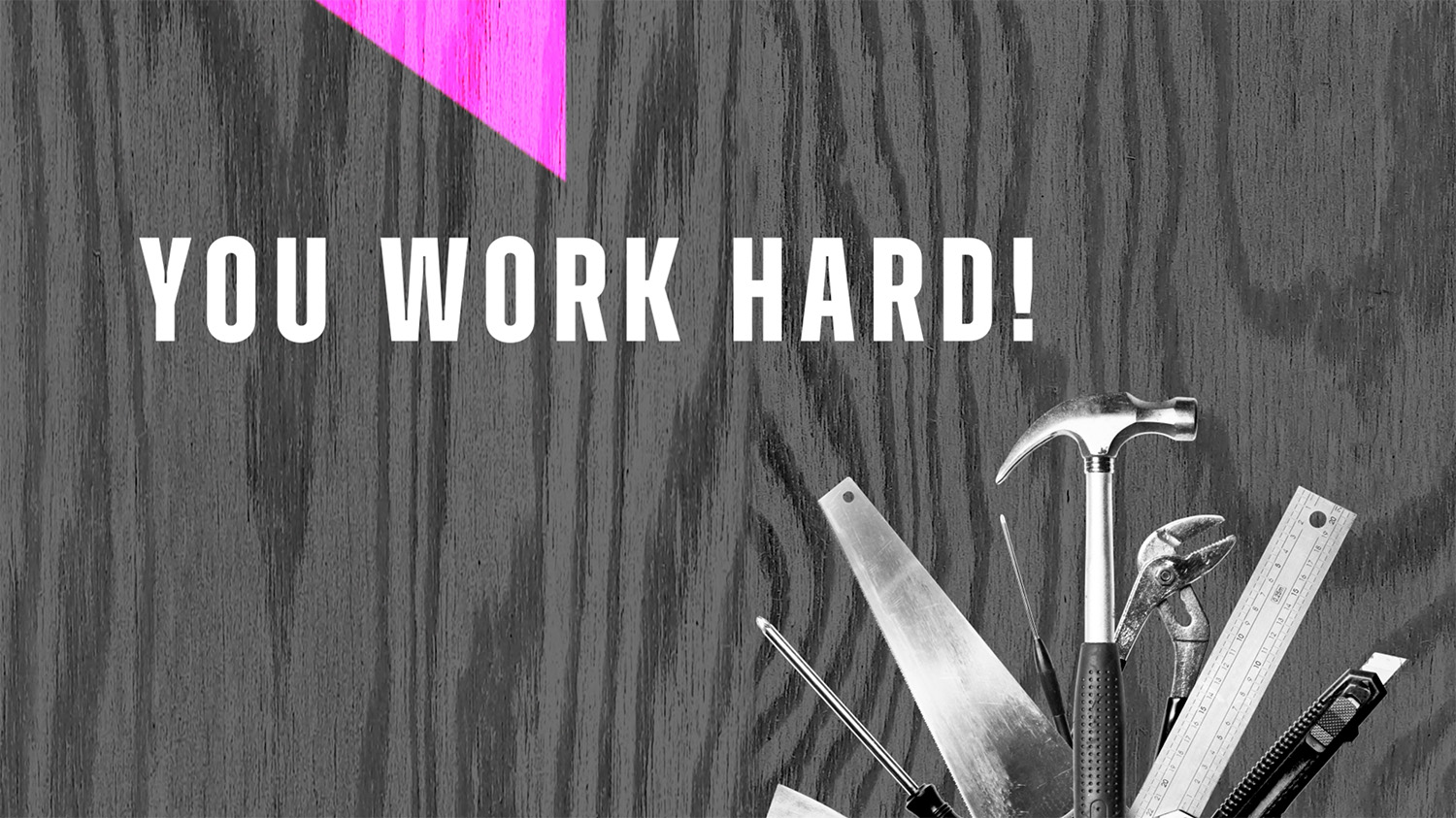
That being said, that didn’t mean we couldn’t have fun with it. We were encouraged to explore the boundaries of the design language and craft it specifically to our target audience.The majority of both video and still assets come from Adobe Stock. We began to pull inspiration from things the trades workers would see in everyday life, posters and signage that feels familiar.
That being said, that didn’t mean we couldn’t have fun with it. We were encouraged to explore the boundaries of the design language and craft it specifically to our target audience.The majority of both video and still assets come from Adobe Stock. We began to pull inspiration from things the trades workers would see in everyday life, posters and signage that feels familiar.


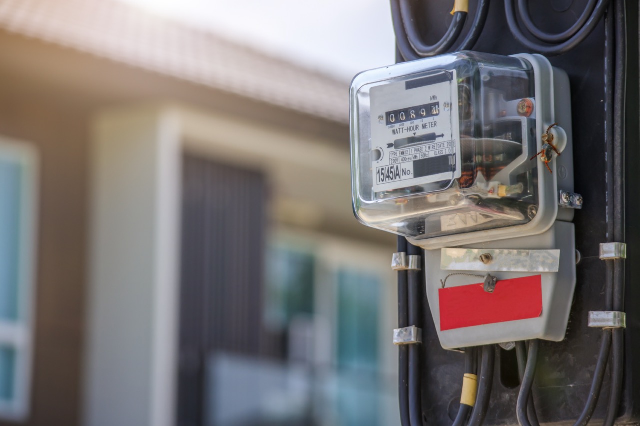





graphic elements
The diagonal lines of caution tape were perfect for this audience, as these are lines that are often found all over warehouses and construction sites.

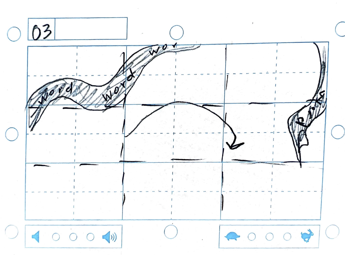
storyboards



still frames
With typography, color, and image nailed down, we could then begin the making process.


video + motion drafts


major insights // what i learned
This project showed me the importance of targeted messaging and working within established brand guidelines while still injecting a personal touch. It also highlighted the value of research in developing communication strategies that connect authentically with an audience.


