REBRANDING AN AMERICAN IDEA // TRANS TRUTH
![]()

concept + brief
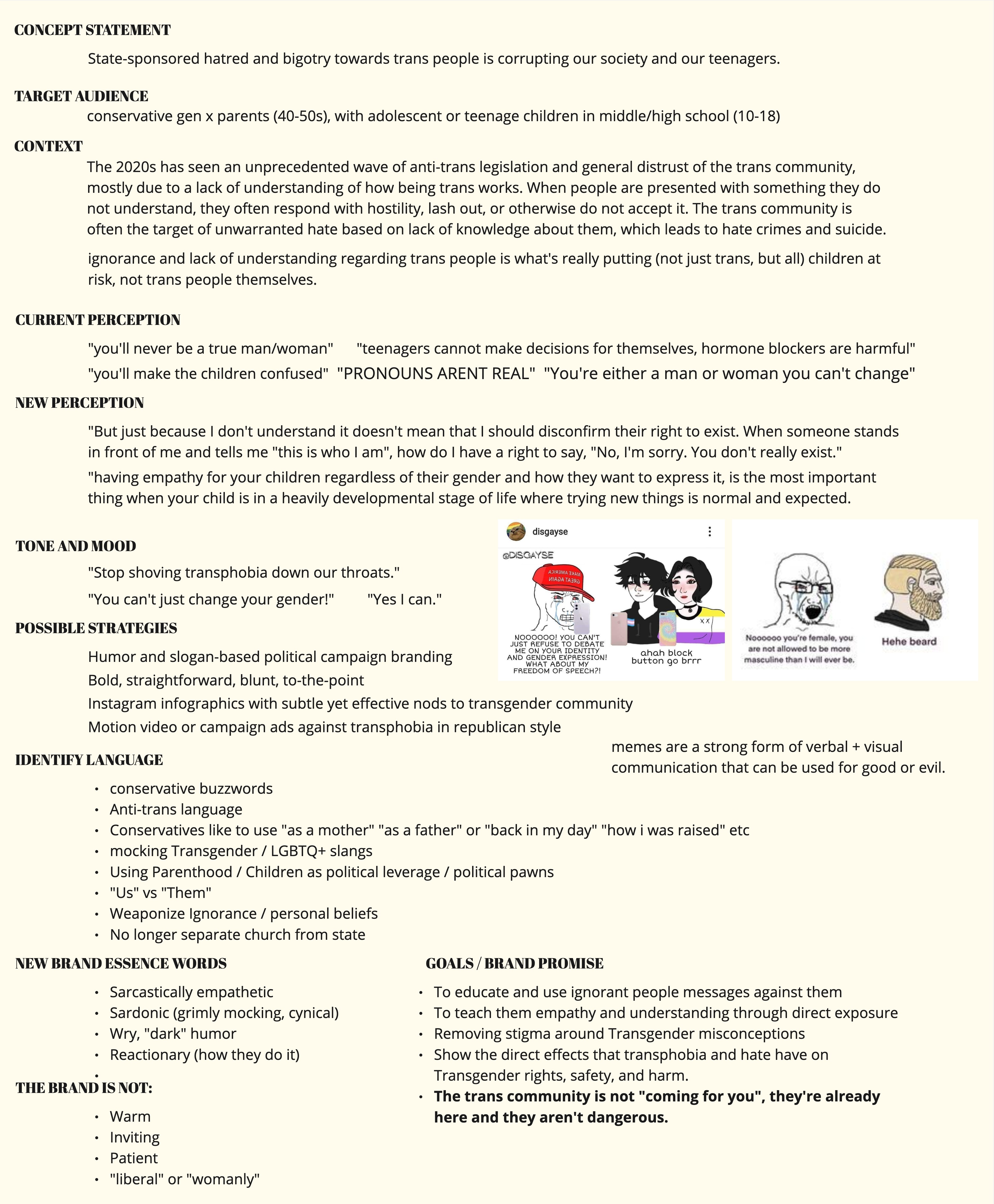
The freedoms of transgender Americans are under attack.
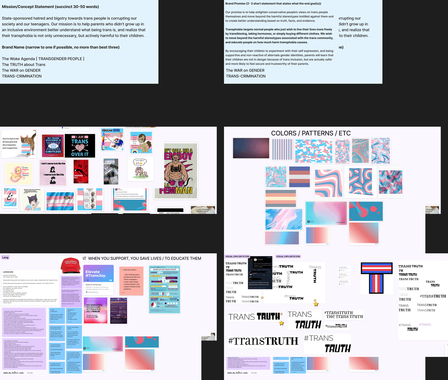
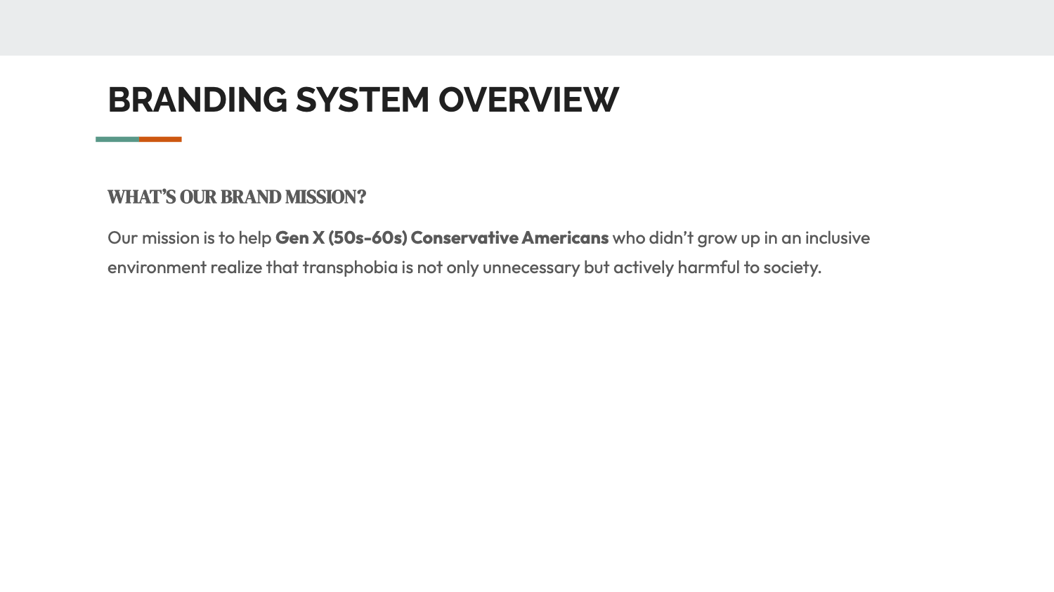
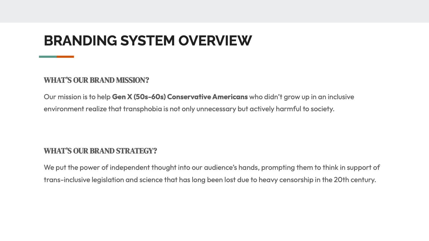
This campaign is about bridging the gap in trans education across the United States. Trans Truth aims to highlight the rich history and existence of the trans and broader LGBTQ community through political rally- style merch, social media posts, and signage. The goal is to bring the trans experience to the forefront and educate those who need it the most.
This campaign is about bridging the gap in trans education across the United States. Trans Truth aims to highlight the rich history and existence of the trans and broader LGBTQ community through political rally- style merch, social media posts, and signage. The goal is to bring the trans experience to the forefront and educate those who need it the most.
research
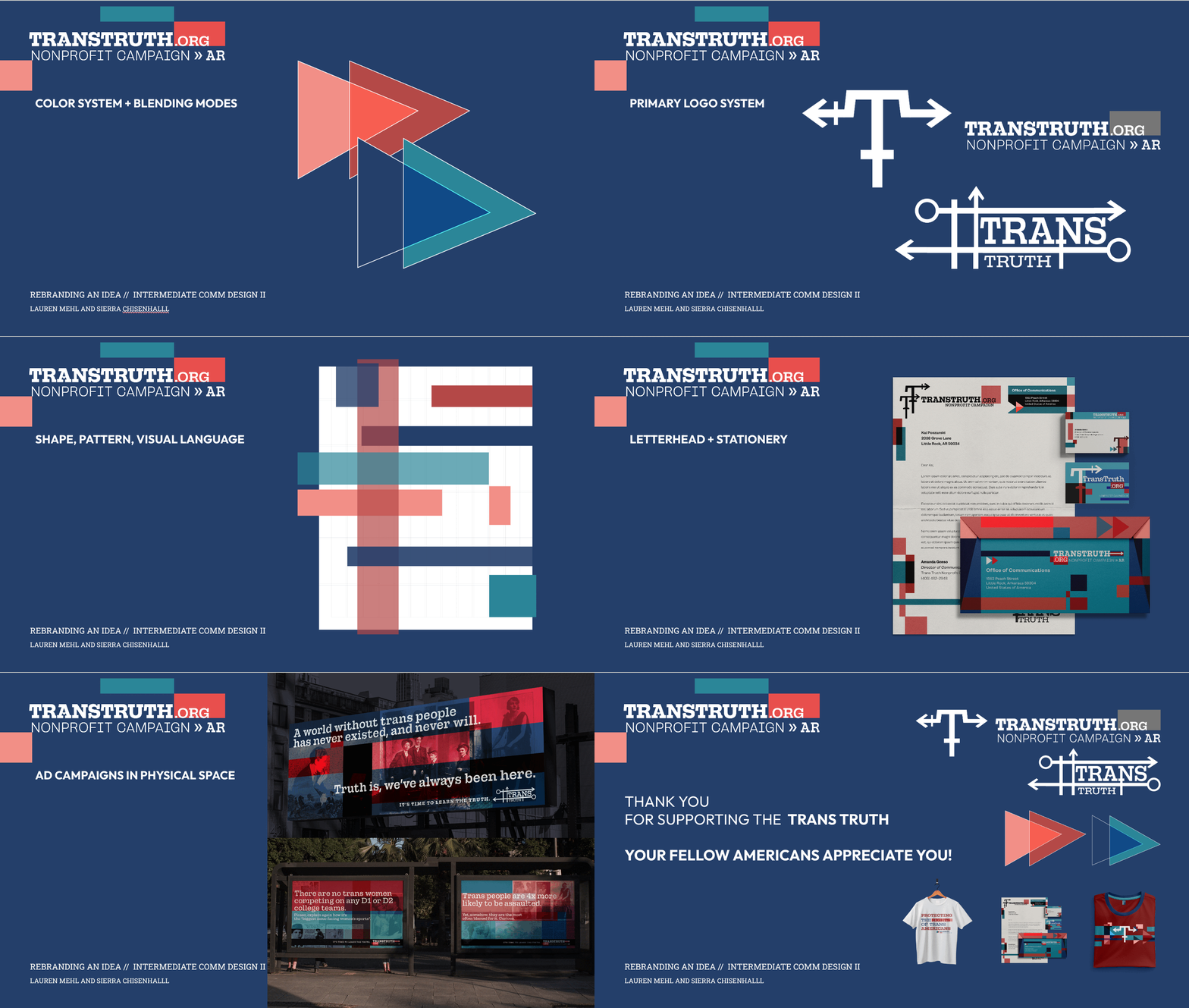
Research and authenticity were at the heart of this campaign. We found that older generations, particularly Gen X and Boomers, lack trans education, and that’s directly leading to more hate and violence-based discriminiation. Especially lately.

language
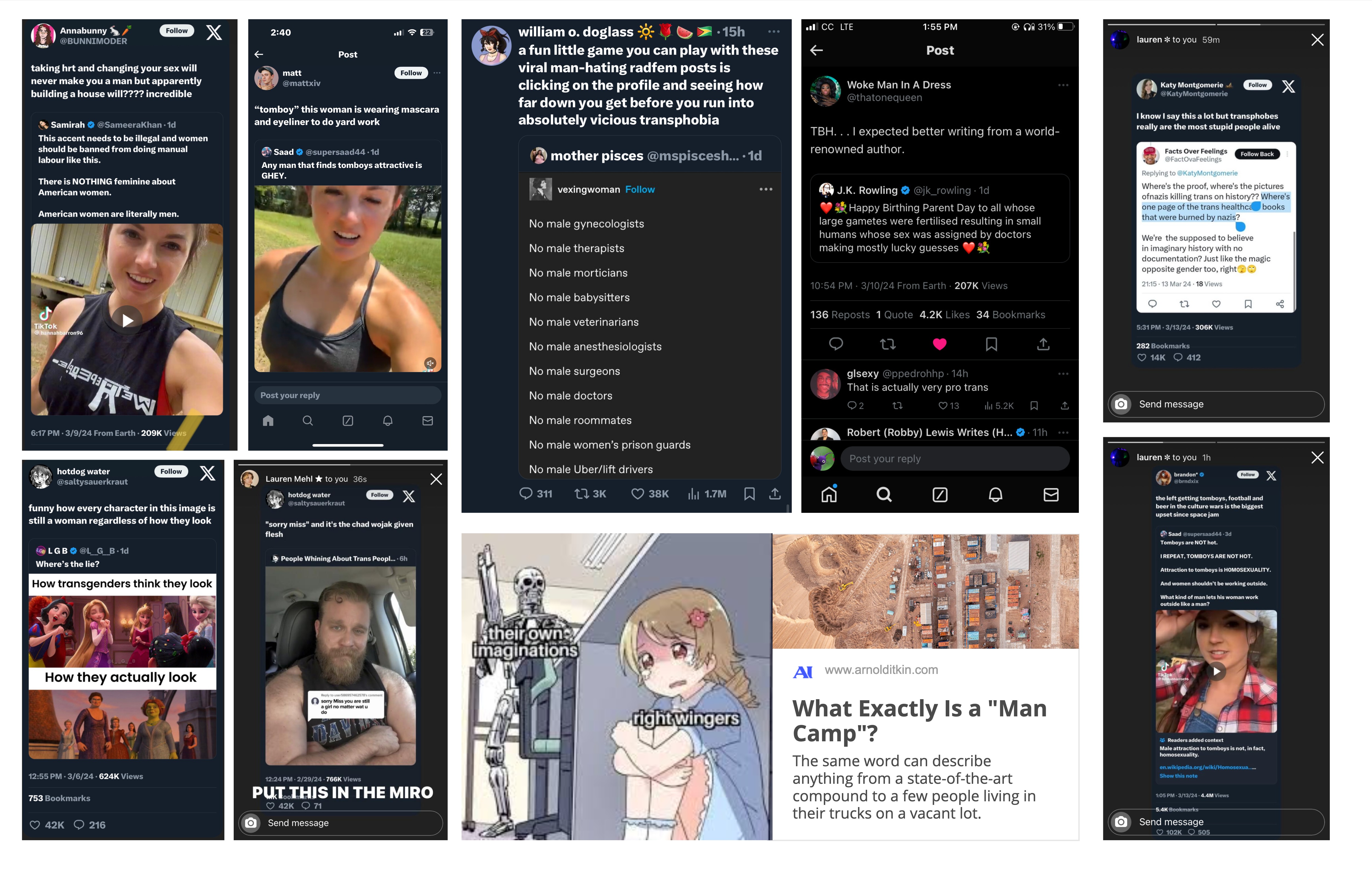
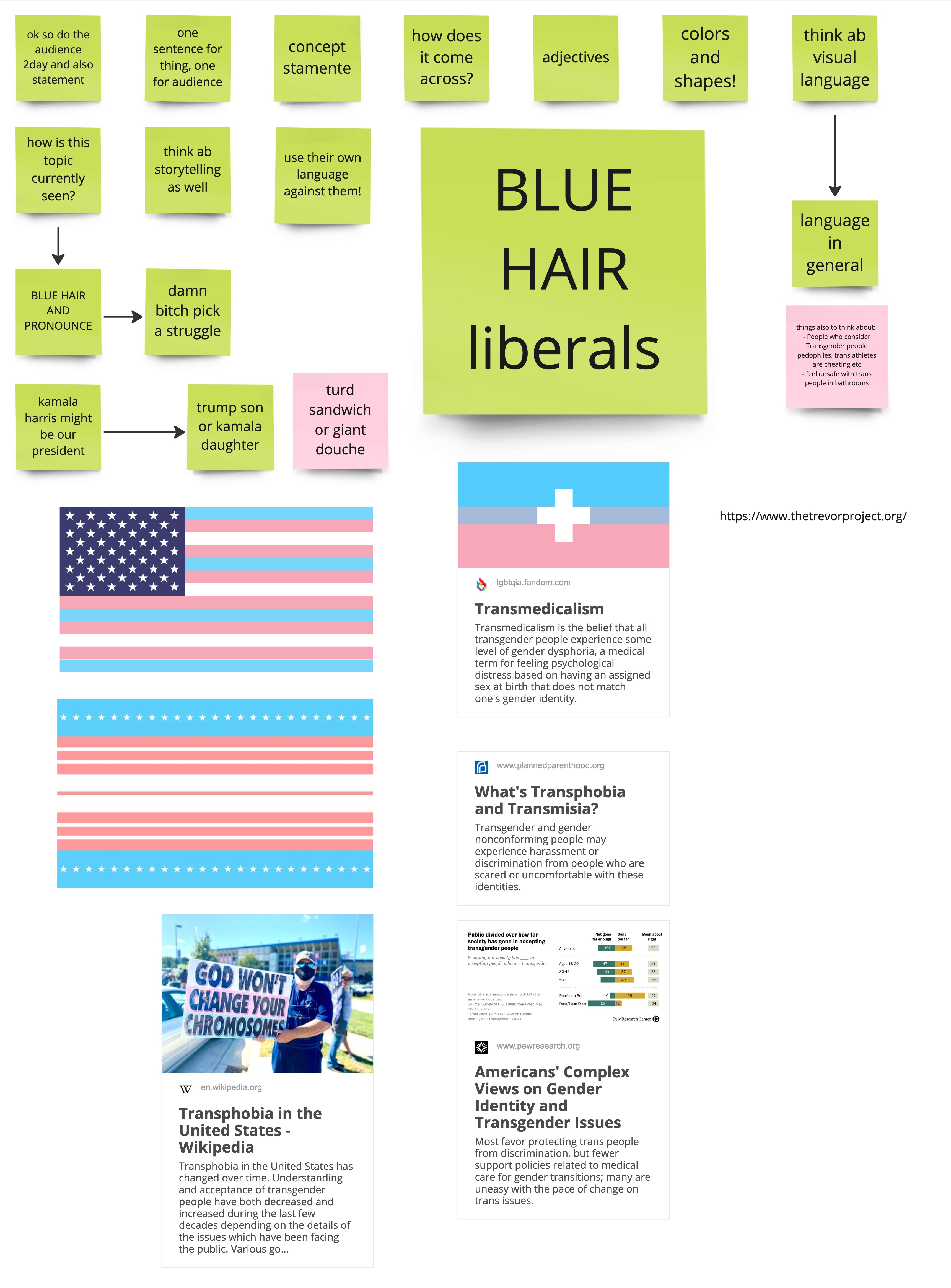
We looked at many conservative news sources and saw how they both talked about themselves, and how they talked about trans people in their posts.
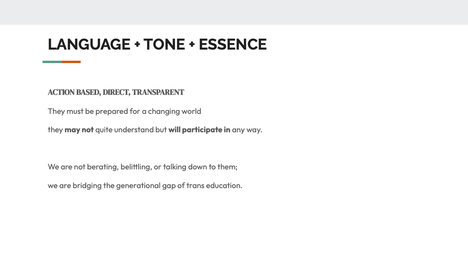
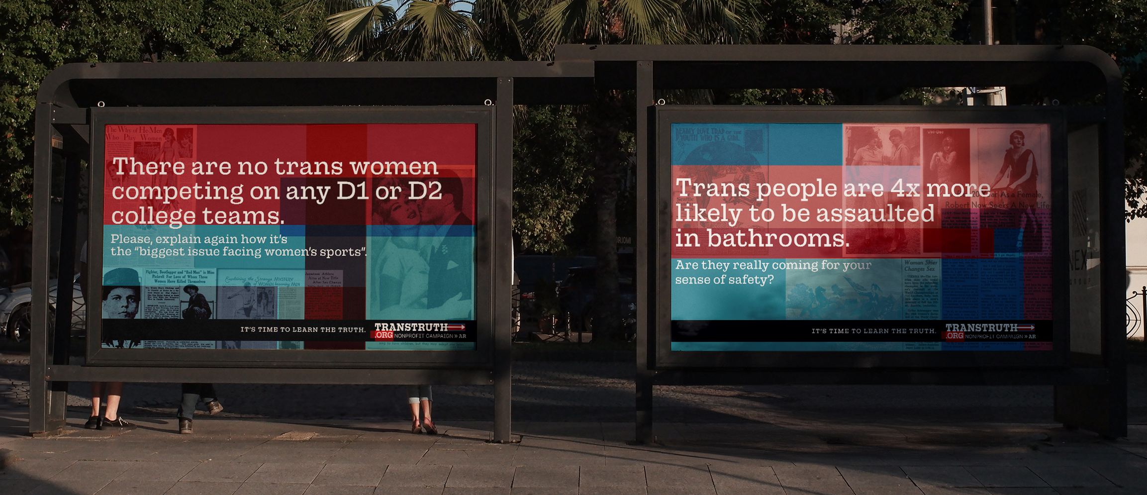
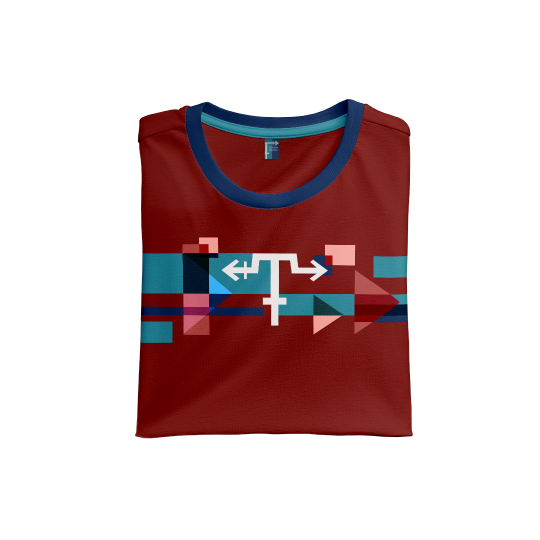
Our approach was to meet them where they are—using the look and feel of political rallies they’d recognize, from merchandise to social media content, to engage them in a language they understand.

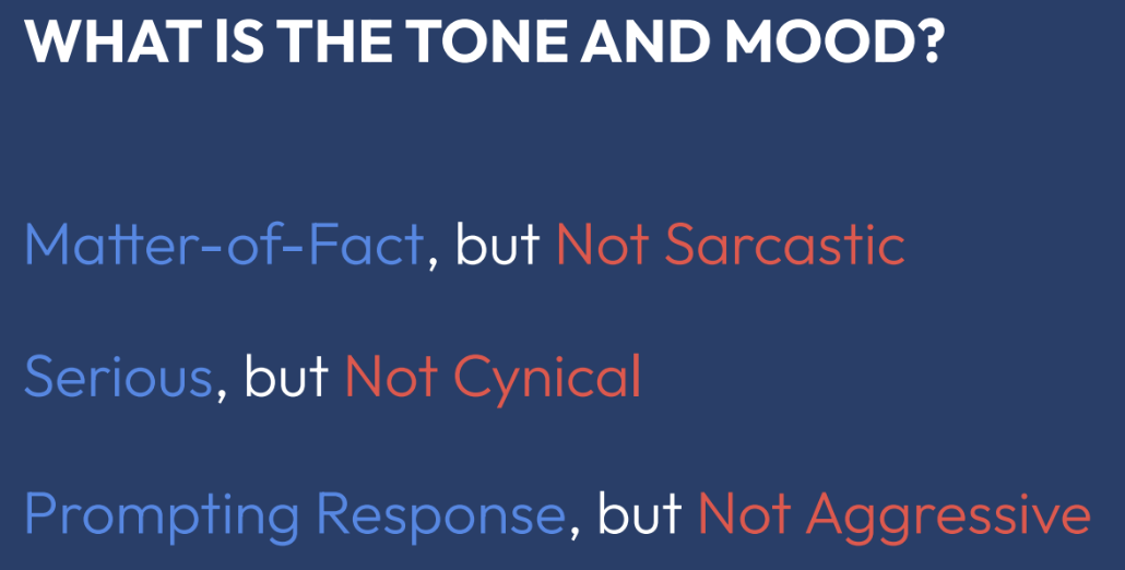
It’s about getting them to support trans rights in a way they might not even expect.
Our promise is to give the power of understanding to our audience, and encourage them to listen and learn for themselves. We live in an ever changing world, and we must be prepared to change with it.
Our promise is to give the power of understanding to our audience, and encourage them to listen and learn for themselves. We live in an ever changing world, and we must be prepared to change with it.
IT’S TIME TO KNOW THE TRUTH.
THERE IS AN ATTACK ON OUR FREEDOM.
LEARN THE TRANS FACTS.
THE HARSH REALITY OF BEING TRANSGENDER IN THE UNITED STATES.
EDUCATING YOURSELF IS THE BEST THING TO DO.
ARE YOU INFORMED?
DON’T BECOME YOUR CHILD’S FIRST ENEMY.
TRANS IS BACKED BY SCIENCE.
THERE IS AN ATTACK ON OUR FREEDOM.
LEARN THE TRANS FACTS.
THE HARSH REALITY OF BEING TRANSGENDER IN THE UNITED STATES.
EDUCATING YOURSELF IS THE BEST THING TO DO.
ARE YOU INFORMED?
DON’T BECOME YOUR CHILD’S FIRST ENEMY.
TRANS IS BACKED BY SCIENCE.
promise

type families

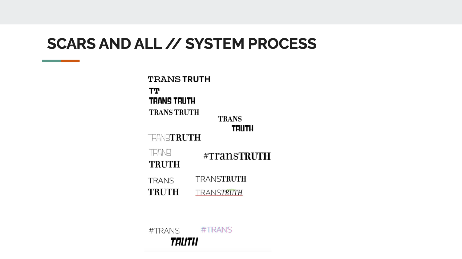
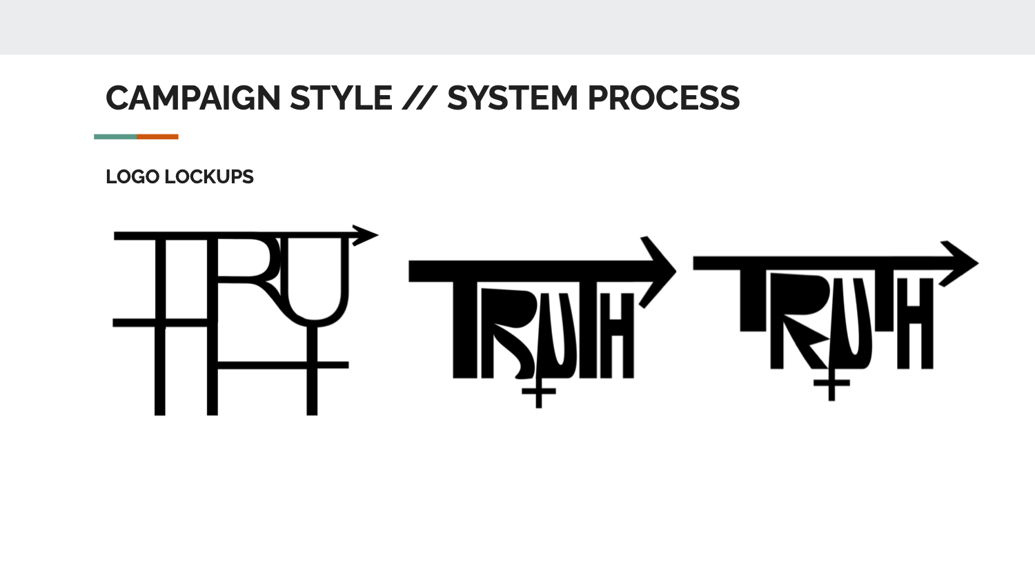
We chose Campaign font because Gen X loves these types of political campaigns. The color and image draws them in and entices them to want to find out more. The geometric, straight, impactful typeface reflects the audience’s need for clarity and truth.
color system


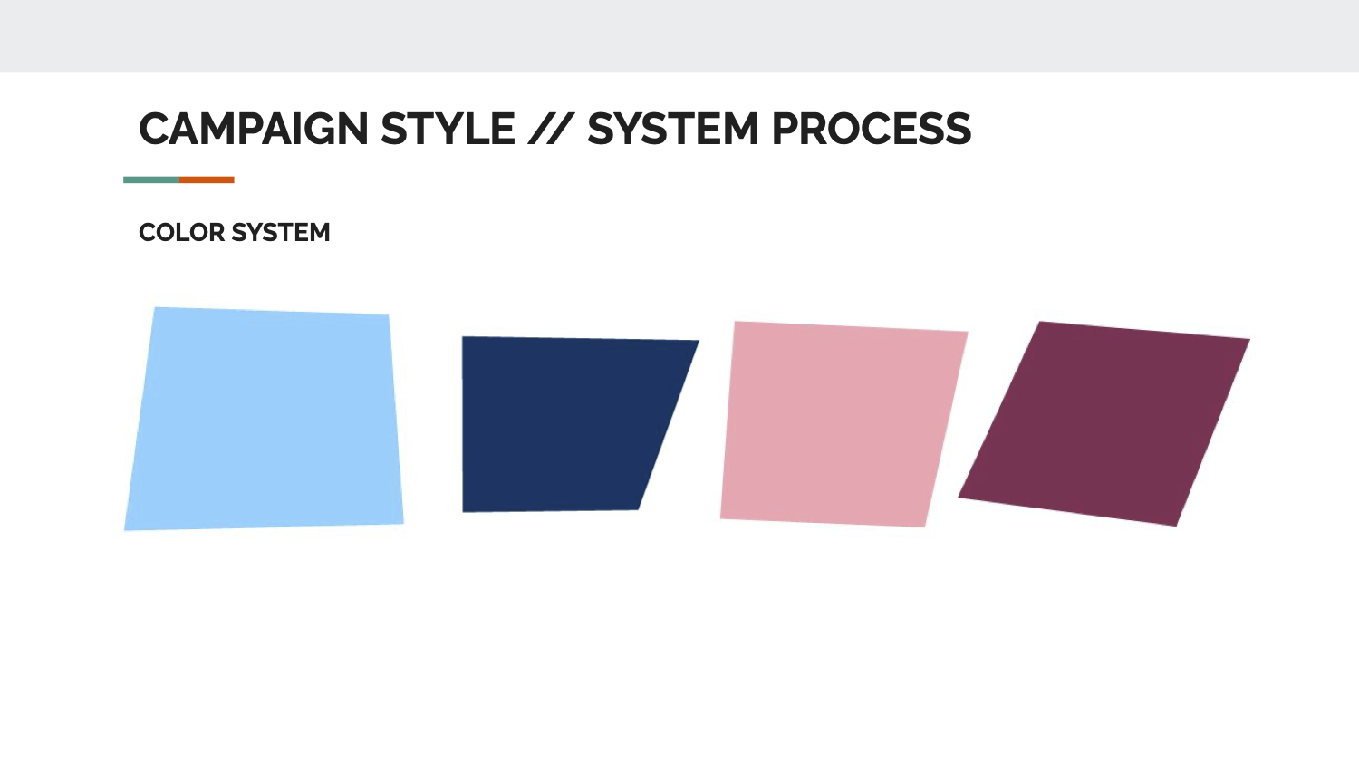
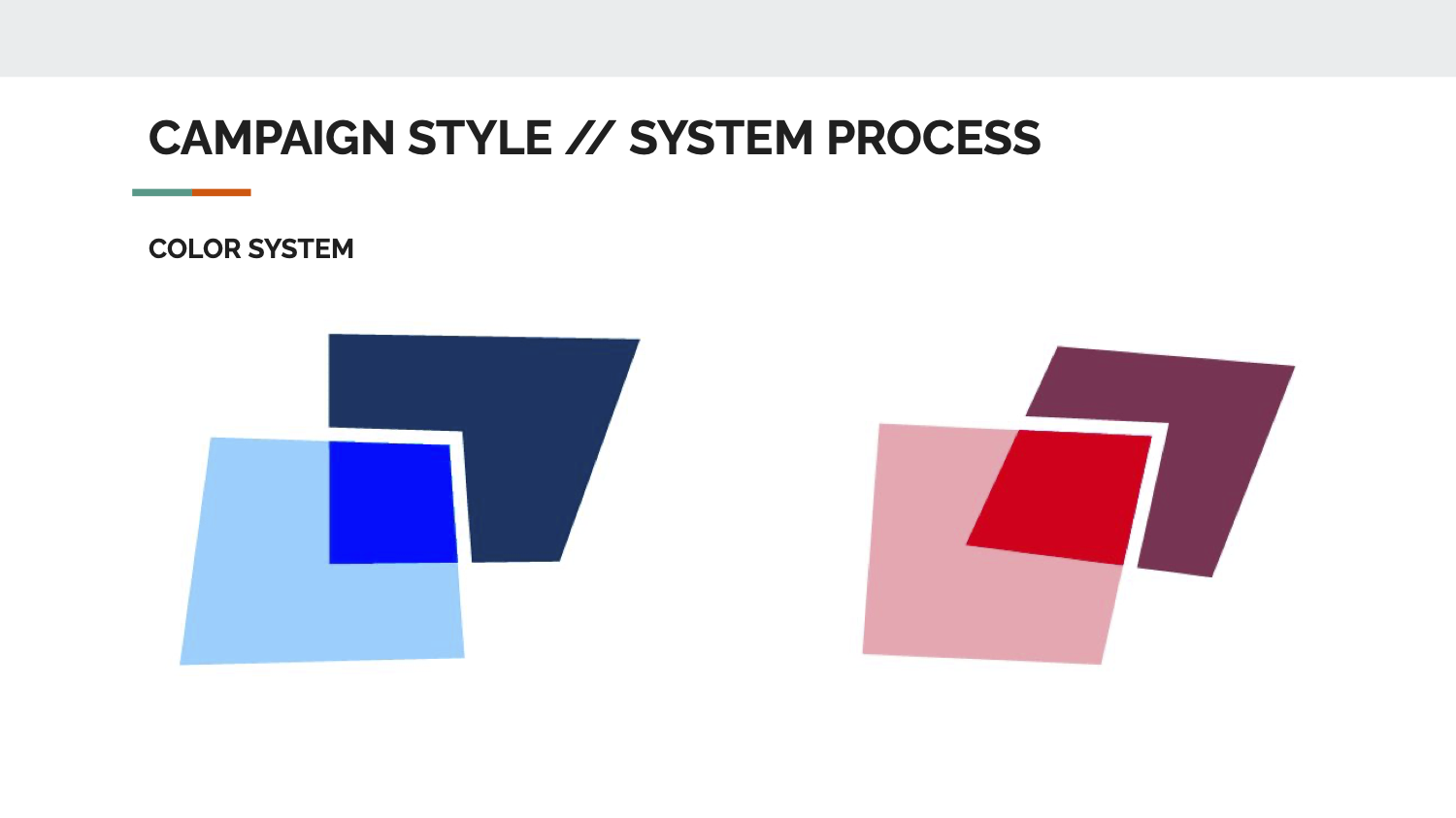
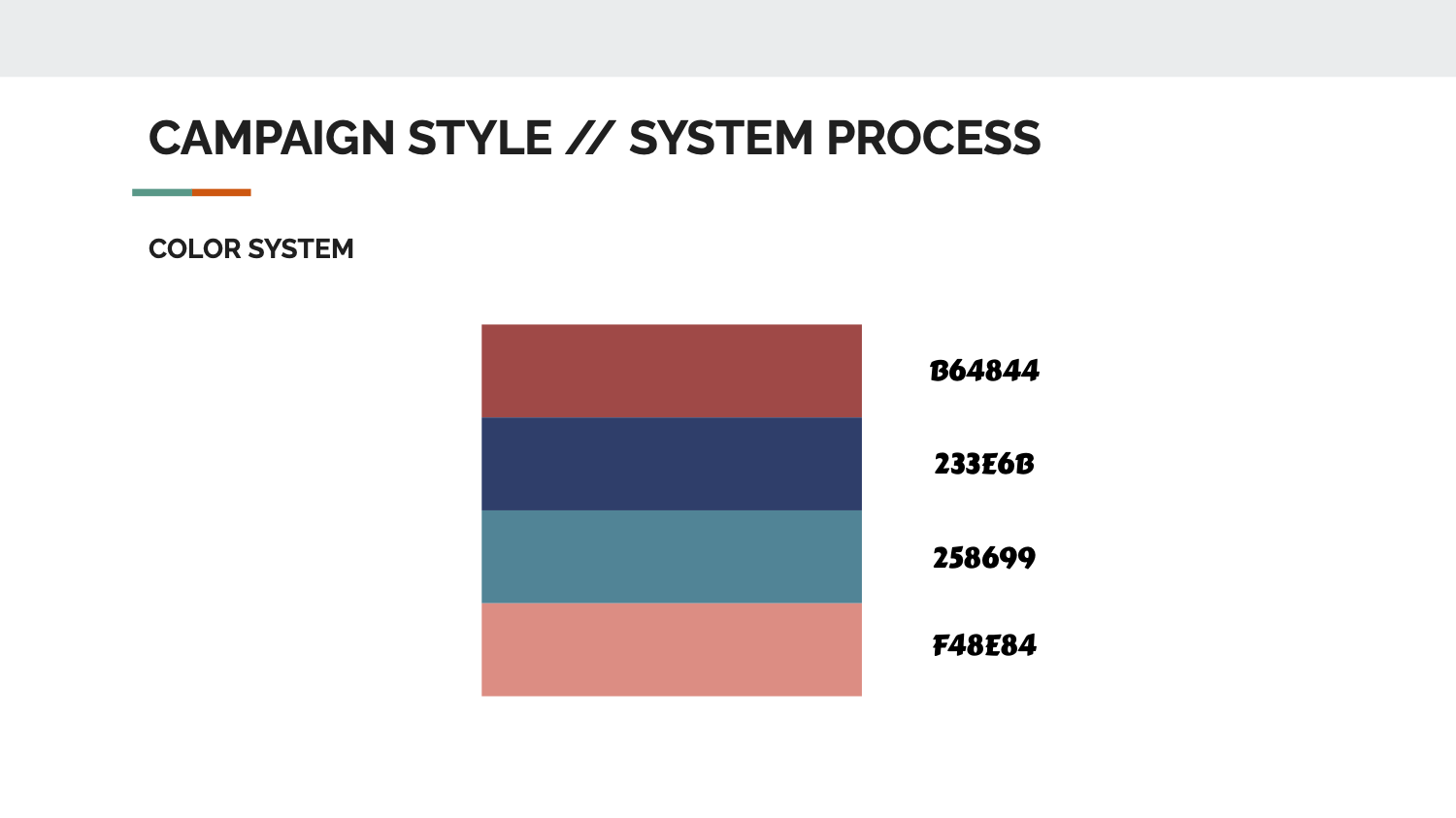
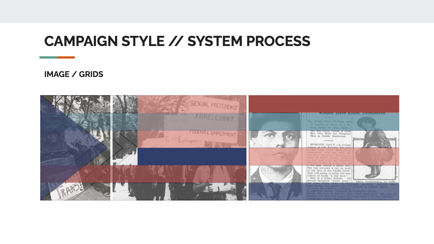
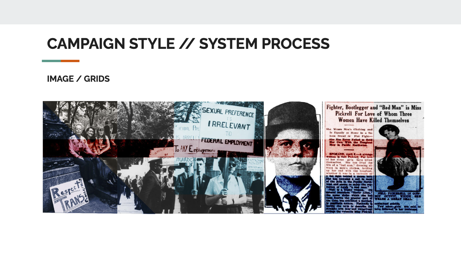
The colors we chose are deconstructions of the pride flags of the US, one for pride of trans identity and one for American pride - two kinds of pride coming together to form the blended color system, meeting in the middle. Really, it’s the same emotion.
![]()
![]()


image archive
Both the American and Trans flag have strong horizontal lines, as well as strong, clearly defined shapes. So, we have reflected those ideas with sharp geometric shapes lined rectangles, squares, and triangles in our graphic language, both to suggest fact and logic but to also suggest the foundational building blocks behind the community being stable and strong.
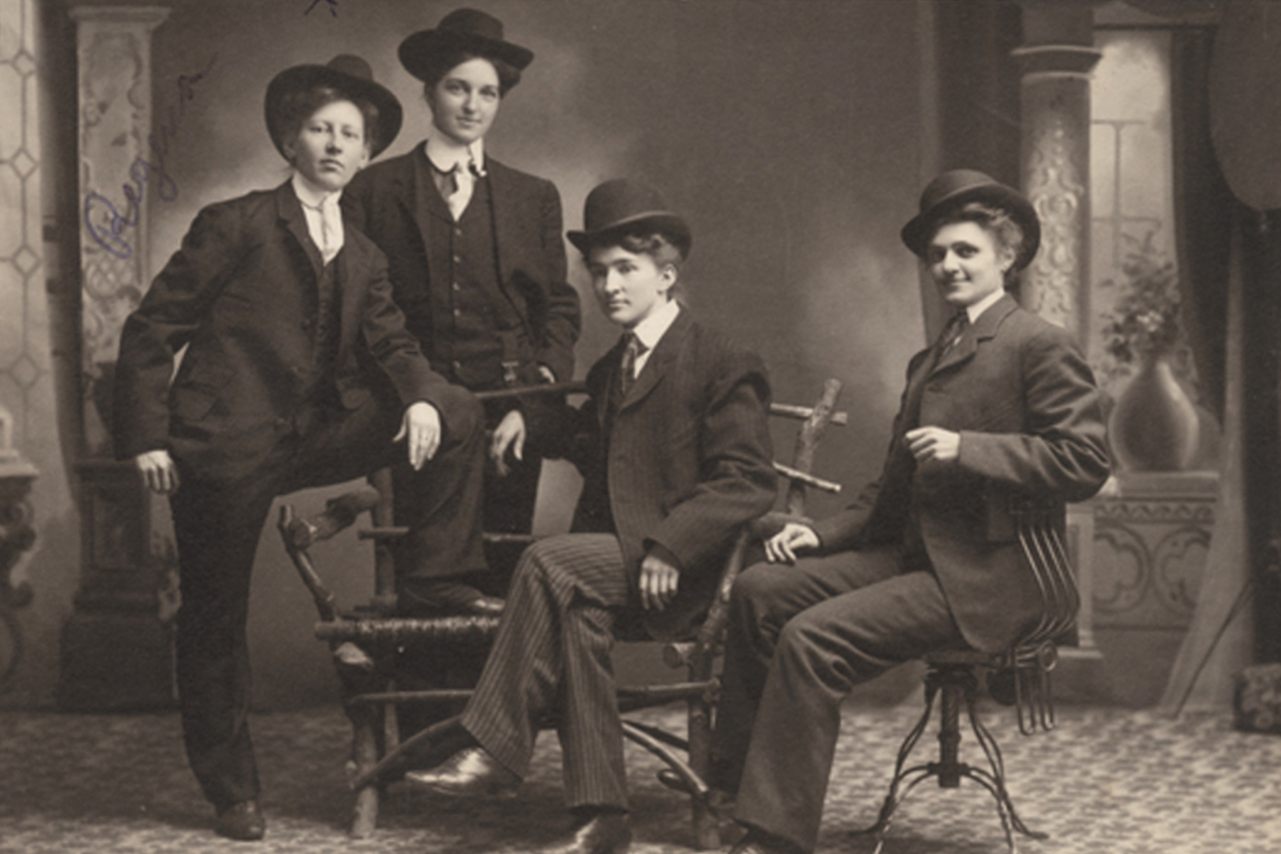
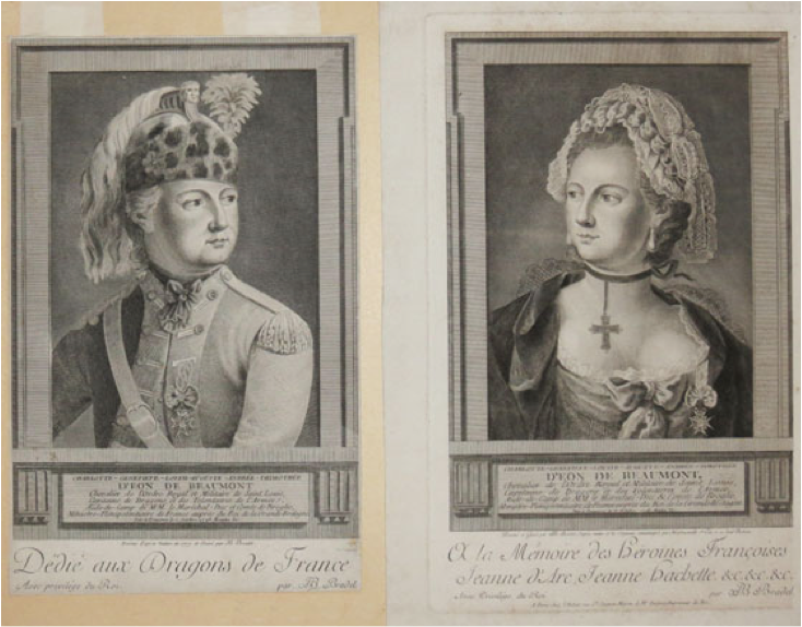


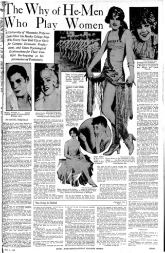

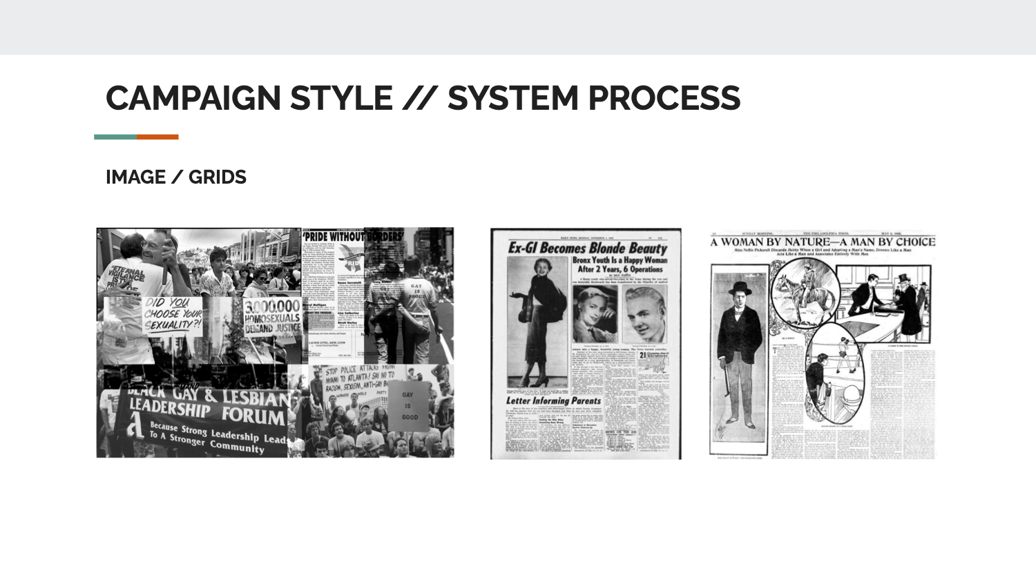
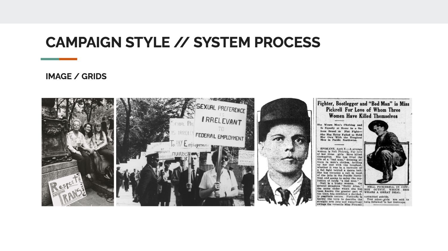
We used resources like the Digital Transgender Archive, which catalogs LGBTQ history from all over the world, to ground our work in real stories and images. We want to help show those who think trans people are a new thing that they are in fact not, and have been around for much of documented history.
process



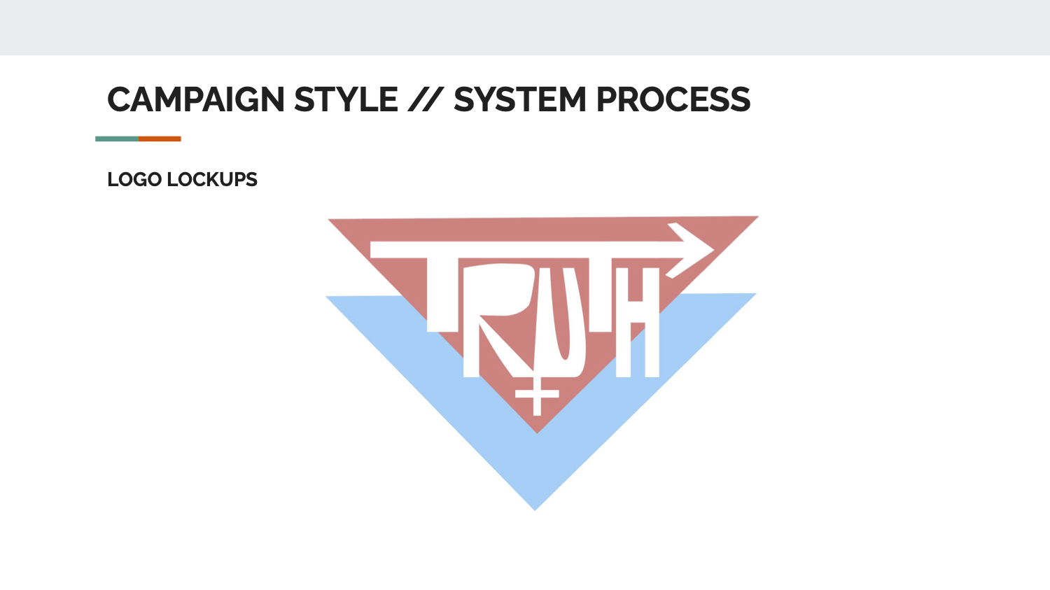


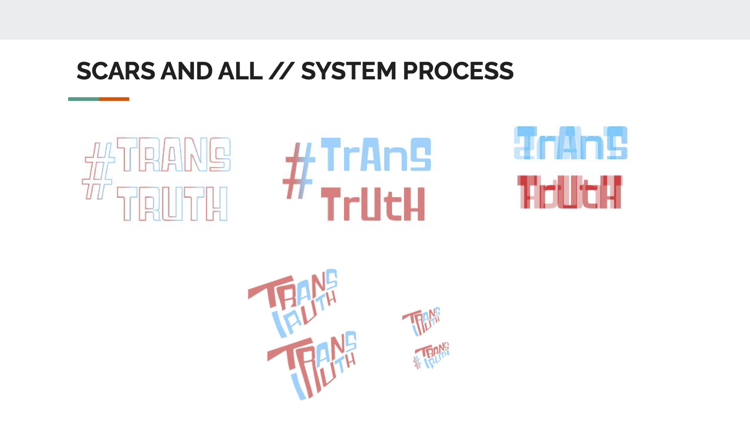
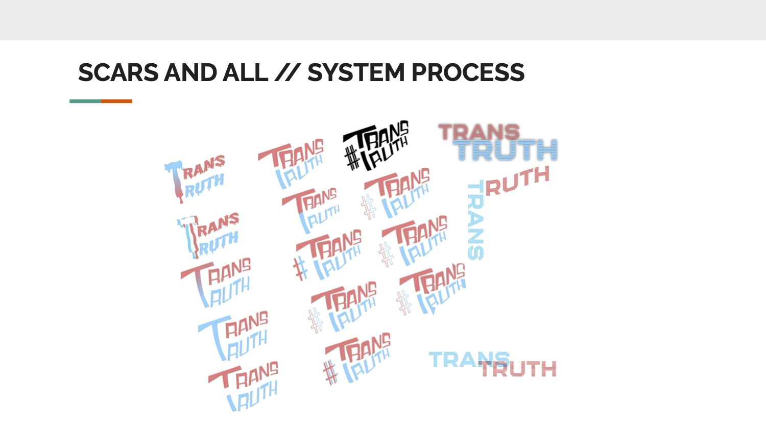
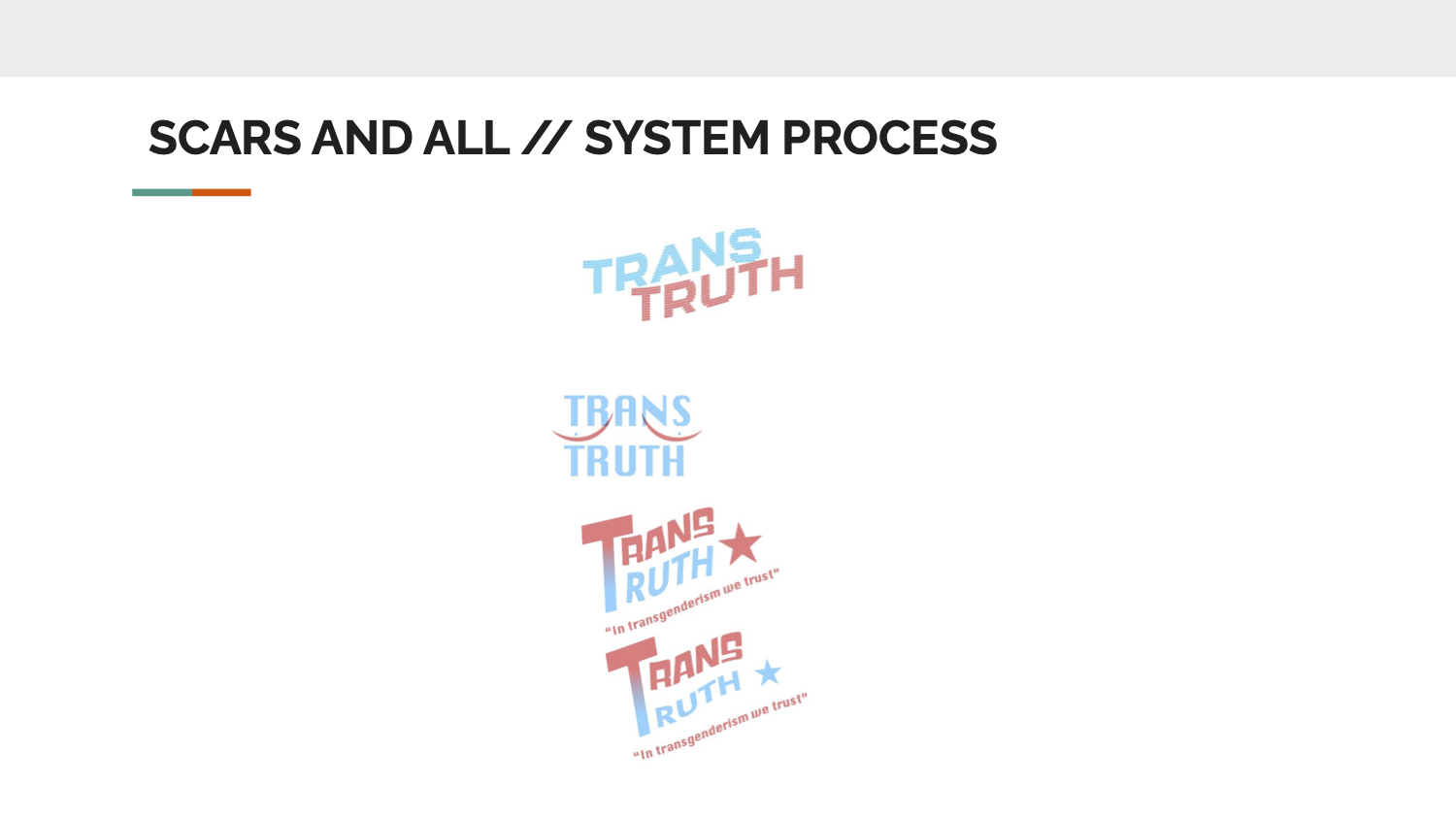
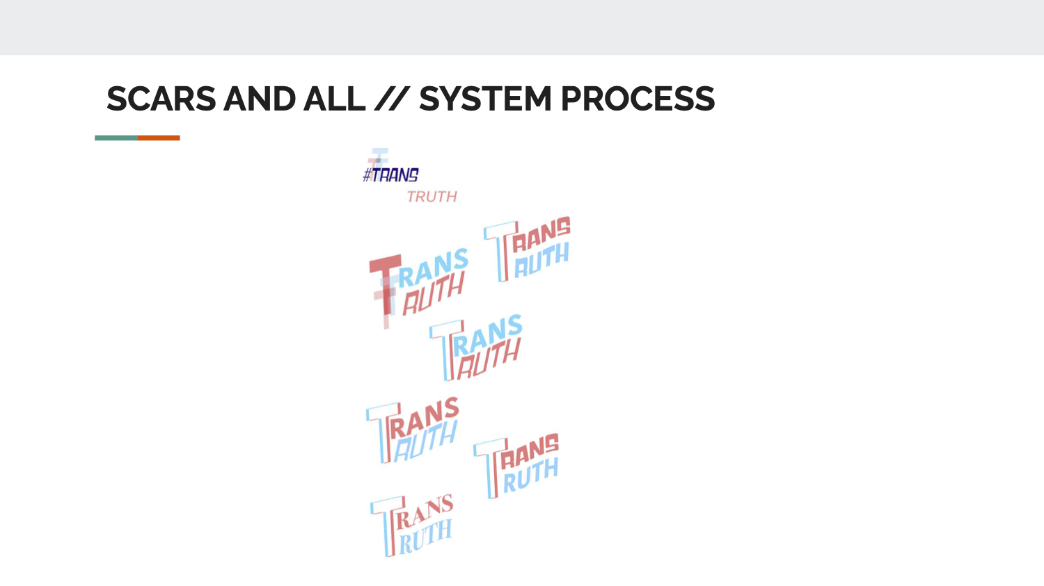
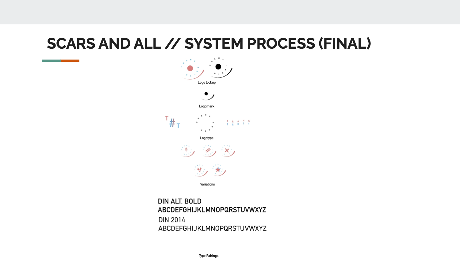





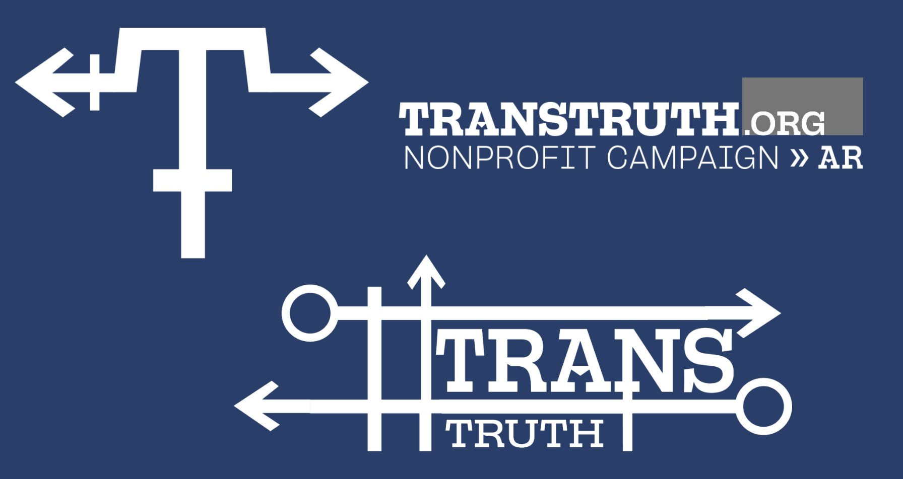
logo system
brand application
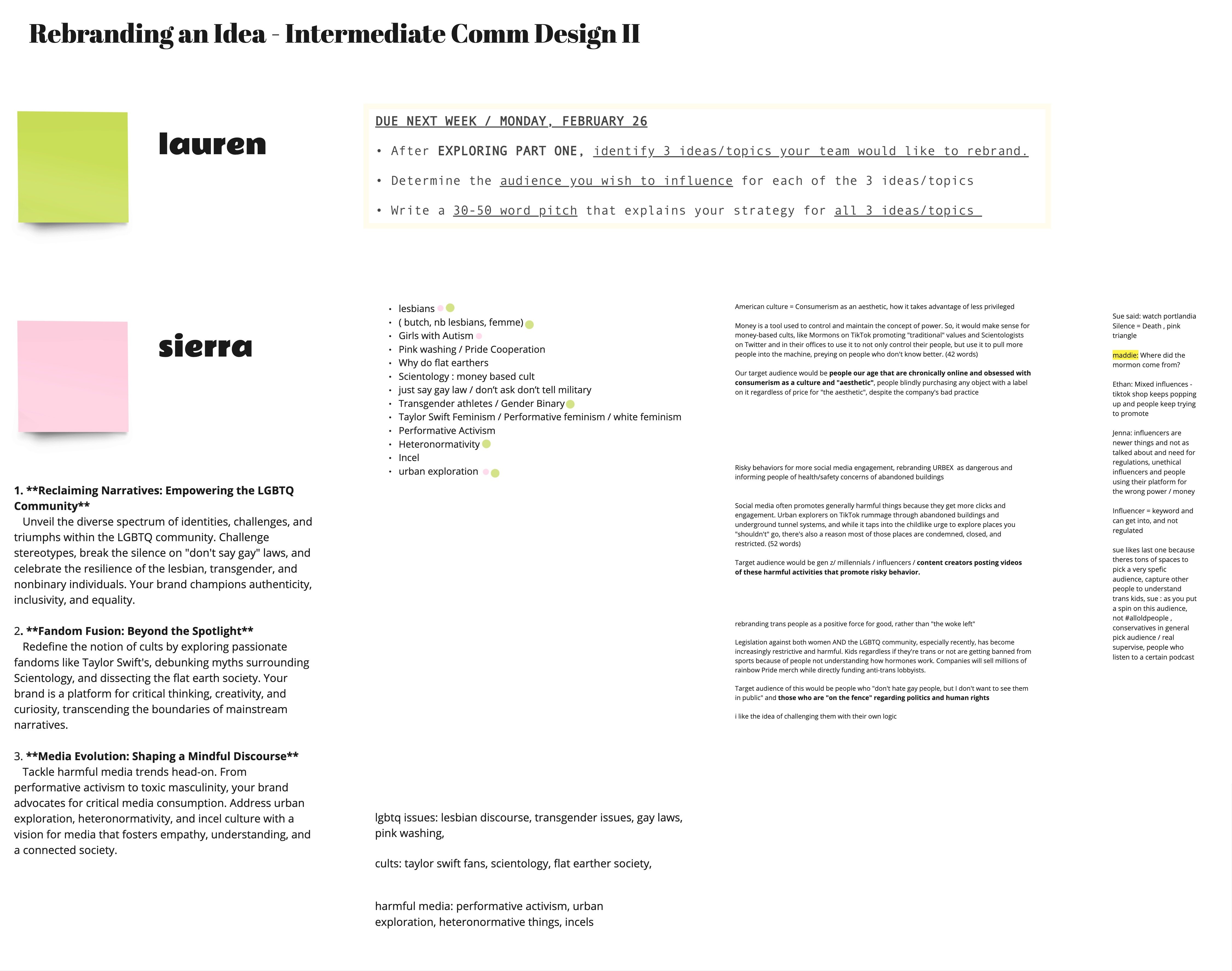
Sierra Chisenhall and I worked really well together, which made it easy to brainstorm and find solutions quickly. We met almost weekly outside of class to keep the project moving. I handled the physical item mockups and stationery design, while Sierra took charge of the web and motion graphics. We collaborated closely on the overall visual direction and style.




major insights + what i learned
This project had a lot of iterations and required constant research. I learned a ton about organizing research, working in teams, and holding myself accountable for deadlines. It was a real lesson in how important collaboration and follow-through are to executing a campaign with impact. With a subject matter so close to both of our hearts, we displayed it in a way it is not usually seen in media or in the world.
